Tuesday, May 19, 2020

Robincam setup


Introduction

I wanted a remote webcam for watching the robin that lives around my apple tree. Trailcams are a bit pricey and I had an old android phone with a half decent  camera laying around doing nothing.

The Phone...

...s a very battered Blu Vivi 6. The screen is broken, the USB C port is loose and the battery lasts about 30 minutes because it has been frozen a few times..

The USB C port is fixed by gluing in a magnetic connector which also seals the port somewhat against the weather.


 I've installed IP Webcam on it from the play store. You can find it here https://play.google.com/store/apps/details?id=com.pas.webcam

I've gone for the Pro version but everything here works with the free one. The only limitations are Tasker integration and the ability to customise the UI. We are not going to use either of those here. I upgraded because I think the developer deserved a coffee (or Russian tea) on me.

Installing it is straightforward and I've also put it on a couple of old HTC mobiles that are being security cams.

To do everything in this article you are going to need a bit of memory. The Blu has 64GB and I'm using about half of it. That's about 1200 jpgs and several hours of mp4s.

I'll talk about how to get the images off to a pc and get the memory back later.

You'll also need a wifi signal where your camera is sited. You can use broadband and access your through the lvideon cloud see here https://www.ivideon.com/

I haven;t got a sim in the Blu so that's not an option.

I use this https://www.amazon.co.uk/NETGEAR-Wi-Fi-Range-Extender-EX2700/dp/B00NIUHAG6/ref=sr_1_5 network extender to get to the shed so I have coverage over all of my garden. Cheaper wifi extenders are available but this one works for me.

IP Webcam Setup

When you start IP Webcam it shows the setup screen. For plain vanilla you can just jump to the last item and it will work.

Before you set up anything you have to give IP Webcam some permissions to photos and sound.


For a start set up the Video Preferences I use the highest resolution possible and lock the camera in Landscape mode.

The other important settings are the motion and sound detection. I have motion detection on and sound detection off. I was getting a lot of false positives from the wind blowing across the camera. Getting the optimum sensitivity will take trial and error and you can play around with this in the web interface.

Starting the Webcam Server

IP Webcam comes with its own webserver so you can connect to it with a browser. When you start the server it tells you the web address that you need to type in to your browser.

The first thing you should do is configure your router to make this a address permanent. I have a BT Home Hub and the important bit of the settings screen looks like this:


If you find this doesn't work and the assigned ip address changes it could be that your phone is registered on the network more than once. Have a look for duplicate names or MAC addresses in your connected devices and remove the ones you are not using.

Power Management

Even with the all the power management options available the application is power hungry, especially if you opt for aggressive focusing which keeps the camera focused constantly so you can take a still image instantly. Note that if you want to record stills automatically you are going to need the IP Webcam add in. I'll blog about that later. If I'm out of reach of mains power, I use an external battery pack. A big RAV 280000mah battery pack like this https://www.amazon.co.uk/RAVPower-Portable-Charger-26800mAh-External-Black/dp/B012V9H3WA/ in a margarine tub with a hole for the power cable.

Weatherproofing

The Blu comes with a silicone case which is sealed except for the camera, headset and power sockets sealed. I've covered the headphone socket with tape. I wouldn't trust it in a raging storm but it has managed the odd shower without coming to any harm. I'm considering sealing it in a food box with only a hole for the camera lens which I can seal with elefant snot (that really is what Blue Tack is called in Danish)

All that is left is to site your camera in an appropriate place and wait for the motion sensors to pick stuff up. The video will record in a local file which you can watch on your phone. Until you get the motion sensitivity fine tuned, expect a lot of false positives. Especially if there is foliage in your camera field. You'll get a video every time the wind blows.

Uploading to cloud storage 

I use google photos to backup and manage the pictures. You can do this through the IP Webcam web interface but the google photos interface is a bit nicer and when they are on the cloud you can safely delete them from the phone.

First make sure you have recorded at least one video.

Setting up photos is pretty straightforward.go to Settings -> Backup and Sync --> Backup device folders and you should see a folder called 'modet.' Add that to the folders backed up and that's it. There's a bit of a lag between recording and the videos appearing in in Photos so be patient.

Expect to be clearing out the false positives frequently. The free allowance for original size photos is 50GB. You'll go through that quite quickly. The great thing is that deleting from Photos also deletes on your device so it keeps it cleaned up reasonably cleaned up.

There is a Dropbox plug in for IP Webcam but I seem to have broken it. I've emailed the developer to see what I've done wrong.

Coming Soon

Next article "Setting up IP Webcam to take still images" coming soon.


Tuesday, May 12, 2020

Underwhelmed

Data and Methodology


If he lockdown was intended to protect the NHS then it might have worked a bit too well. We were told we had to flatten the curve and we did. But by how much? We've seen the stories of empty hospitals and because elective and non urgent surgery cancelled.

Here's a chart generated from https://www.england.nhs.uk/statistics/statistical-work-areas/covid-19-daily-deaths/. I haven't done anything with it except cut and paste the totals of daily deaths by age into Libreoffice calc, Transform it from columns to rows and then copy it to Google sheets, which I've used for all the other manipulation.


And here's a chart I made from publically available data.


The blue bars are daily hospitalisations derived from 

The red line is:
That's all data. I'm now going to step into the realm of models and speculation.

The big surprise came when I came to construct a tall thin bell curve with the same area which just failed to breach the capacity line.

The tall thin curve came later with a slower incremental part.

I know this can't be right. But as they say, "all models are wrong and some are useful."

This one is obviously wrong and not very useful. If you think you can improve it please do.

If I get the time and the inclination I will generate some numbers from my RCalc program to try to make a different shaped curve. I'll need to make a branch of the code so I can add add some fudge factors (something I  because the aim of the code was to find the bell curve, not fit it to real life) the results of R0=3 has 70 million people infected in 17 iterations and the opportunity factor doesn't get a chance to pull the curve down. The spreadsheet calculations are obviously crude and somehow wrong. My focus was to get a bell curve with the right shape and the same end total. The fact it had the same width is a mystery to me. It is not designed in to the formula. And I messed up the horizontal axis labels.

As ever all source data is on github here:

https://github.com/davidsinfield/RValue/blob/master/Underwhelmed.ods

It's freely available, do with it what you will.


Before you comment

  • There is no doubt that this is a dangerous disease to the vulnerable. I am not trivialising it.
  • The hospitals have done a grand job and the lack of masks and gowns was a fiasco. I'm not sure what could have been done about it. And I have no intention of being drawn in to a recriminations.
  • I have no wish to kill you or your granny. I'm a grandad I'm well into the age danger zone with a highish BMI and I would be considered quite vulnerable. 
  • The third chart is very definitely wrong. I don't need to be told I am open to suggestions as to how it can be improved.

Tuesday, May 5, 2020

Covid-19 Correlations

Where I started

I was thinking about why there was such a wide spread of values of deaths per million from or of Coronaviris across the 48 countries of Europe so I decided to look at some correlations. It's important to note these are not direct country to country comparisons, I think we all know by now they are very dangerous. Rather they are a statistical method to see what the possibility that a pair of sets of values are somehow linked. The strength of a correlation is measured in the P (for Pearson) value and they range form -1 negative correlation through 0 (no correlation) to +1 positive correlation. A negative correlation means that as one value gets bigger, the other value gets smaller. A positive correlation means that the values increase or decrease together. I used to do rank correlations by hand for my OPen University courses but that is hard work and we now have computers that can do that stuff for us. I used LibreOffice calc and it a matter of fractions of a second to get an answer that would certainly taken hours using the old pen and paper method.

"Correlation is not causation" is a very important concept. It might be that there is a spurious correlations. There are some great spurious correlations of time series here:

https://www.tylervigen.com/spurious-correlations

However given a strong correlation of P>.5 it is certainly legitimate to hypothesise for causation.

Population Density

My first instinct was that it was due to population densities. It seems obvious that if you cram people together the spread of disease will be faster and you may get a higher mortality per capita than more sparsely populated countries. So what does the correlation look like?

The P value is 0.234105007129706 which represents a weak positive correlation. Not very much above chance. I was surprised.

That is certainly not a good enough correlation warrant searching to hard for a causation

Life Expectancy

We generally think of Life expectancy as an indicator of the quality if health and social care and general health of the population. The longer the live expectancy the better we were doing. So you'd expect the longer the live expectancy, the better the health and social care available and there should be a negaitive correlation, that is as life expectancy goes up, mortality goes down.

The European values range from 71.72  to 85.42 a pretty wide range for what we would all expect to be developed industrial countries.

I tried life expectancy against deaths per million. P value is 0.529. That is certainly more significant. Yes, thats a positive correlation. as life expectancy goes up so does a country's mortality rate for the Chinese Cough.

It seems therefore that a high life expectancy is a disadvantage where it comes to mortality from this virus. So maybe it is not a good indicator of the quality of health, social care and fitness after all. Maybe it's just an indicator that we can keep sick people alive longer. I'm not that sure that's a good thing when a pandemic strikes.

There is an alternative explanation. It could be that the reporting in countries with a lower life expectancy is less accurate and they are underreporting deaths from or with to coronavirus.

I'll let you decide.

Data


I did this a while ago and the data is from Worldometer from Wednesday 29th April. The Uk has changed its reporting method since then to include non NHS deaths. I don't know whether this has a large effect but I'll do a revision if I get a chance.

The spreadsheet of values I have used is here 


Risk takers and risk averse

Over the two hundred thousand years of the human race we have evolved a strategy for the survival of the species. It's worked pretty well. One of the cornerstones of the strategy finding a balance between the risk takers and the risk averse. The argument about whether this is nature or nurture is

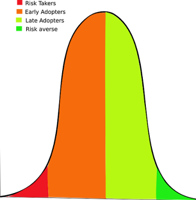
Here's a very quickly drawn diagram (I have a love hate relationship with Inkscape.)


There's no scale and no attempt at quantifying it. The numbers might be distributed differently but it is what it is.

The important parts as is very often the case are the two edge cases.

The red zone are the risk takers, this is where innovation comes from. The first person to tame a horse, Montgolfier, the Wright Brothers, Edmund Hillary are all in the the red zone. So are all all the entrepreneurs and small businesses. This is the source of all innovation. Some fail. But the ones that succeed make the leaps forward that eventually filter up the other groups.

The green zone are the risk averse. They like the status quo. New ideas and things will only filter down to them after the early adopters and late adopter have proven them. It's very difficult to name them individually because their impact on the species is taken for granted. They take the absolutely safe path. They will survive. They will breed, they will continue the species. Luckily they will breed some a few more risk taker than risk averse because some of the risk takers fail in a spectacular fashion.

Over most of the 200,000 years of the human race this balance has been maintained successfully.  We have thrived. The risk takers have given us innovation and the risk averse have ensured we haven't entirely wiped ourselves out.

The reason for the balance is that we have been allowed to make our own risk assessments.

Consider what happens when we are forced by regulation to be come risk averse....